
Understanding Time Series with R
(This article originally appeared on KDNuggets.com here. For more, visit https://www.kdnuggets.com/)
Analyzing time series is such a useful resource for essentially any business, data scientists entering the field should bring with them a solid foundation in the technique. Here, we decompose the logical components of a time series using R to better understand how each plays a role in this type of analysis.
Analyzing time series can be an extremely useful resource for virtually any business, therefore, it is extremely important for data scientists entering the field to have a solid foundation on the main concepts. Luckily, a time series can be decomposed into its different elements and the decomposition of the process allows us to understand each of the parts that play a role in the analysis as a logical component of the whole system.
While it is true that R has already many powerful packages to analyze time series, in this article the goal is to perform a time series analysis --specifically for forecasting-- by building a function from scratch to analyze each of the different elements in the process.
What are the elements of a time series?
There are several methods to do forecasting, but in this article, we’ll focus on the multiplicative time series approach, in which we have the following elements:
Seasonality: It consists of variations that occur at regular intervals, for example, every quarter, on summer vacation, at the end of the year, etc. A clear example would be higher conversion rates on gym memberships in January or a spike in video game sales around the holidays.
Trend: It can be categorized as a general tendency of the data to either decrease or increase during a longer period, for example, in the stock market, generally a “bear market” on average could be marked by a general decrease in stock values for a period of around two years. Of course, this is an oversimplification, but we get the idea.
Irregular Component: You can think of the irregular component as the residual time series after the previous two components have been removed. The irregular component corresponds to the frequency fluctuations of the series.
With these components, we can create a model in the following way:
Y i = Si * T i * Ii
Implementing this in R is relatively straight forward, so let’s open a new notebook, and let us write some code.
Time series forecasting in R
To start, let’s create a data frame with the data we’ll be analyzing. Suppose that you are looking at data on sales over time and that you have total sales vales by quarter.
x<-seq(1, 20)
y<-c(2.8, 2.1, 4, 4.5, 3.8, 3.2, 4.8, 5.4, 4, 3.6, 5.5, 5.8, 4.3, 3.9, 6, 6.4, NA, NA, NA, NA)
data <- data.frame(t=x, sales=y)
data
To provide more context, in the snippet above, we are creating an array of sales by quarter for five years. Notice that we have included four “NA”s, these are the values we are going to forecast. Because we are looking at quarterly data, this means that we’ll be forecasting year five.
By plotting the data we can probably get a more insightful perspective of the dataset:
data %>%
  ggplot(aes(x=t, y=sales))+
  geom_line(col = 'light blue' )+
  geom_point()+
  xlab( 'Time' )+
  ylab( 'Sales' )+
  theme_minimal()
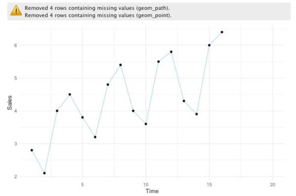
In the plot, we get a warning, but we don’t need to worry about this because it’s due to the missing values we have on the dataset.
By looking at the plot, it’s fair to say that we can quickly spot a trend and also that there seems to be a seasonal factor. Generally, we see that in the second quarter sales tend to decrease, then in the third quarter, there is substantial growth, and finally, we can spot a modest increase in the fourth quarter.
Now, if we were to ask someone with some statistical knowledge, how can we create a model to predict values on this dataset? Intuitively, some could say that we can model this with linear regression. Indeed, that’s one approach we could take, but there are a few problems with that. In order to show as opposed to just tell, let’s see how that would look like.
ggplot(data, aes(x=t, y=sales), col= 'light blue' )+
  geom_point()+
  stat_smooth(method= "lm" ,col= "red" )
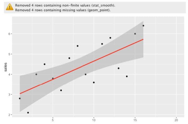
So what’s the problem with that? If we look at the previous plot, we can clearly see that the data is affected by both a trend and a seasonal factor. Therefore, if we use a linear model, we are not capturing all of those changes. Even though we seem to have a relatively good fit, we can definitely do better by considering changes at the local level and the overall trend. By local, I mean that each year has its own fluctuations, so we can capture that information to improve the model.
In order to catch both the trend and seasonal changes, the first step we can take is to calculate moving averages (local) which can help us analyze data points by creating a series of averages of different subsets of the full data set, in this case, each year, this means that we can only calculate a moving average for any instance where we have at least four data points.
This is how it would look in R:
df <- data
Y <- 2 # 2 is the position of our "sales" column in the data frame
k <- 4 # k is equal to the size of the subset

#Array with all of the raw values of 'Y'
arr <- df[, Y]

#Empty array to store the values of the moving averages
MM<-rep(NA , length(arr))
index <- k-1

for (i in c(1:length(arr))){
  if (i <= length(arr) -k+ 1 ){
    block <- mean(arr[seq(i, i+(k-1))])
    MM[index] <- block
    index <- index+ 1
  }
}

MM
Which should give us the following array:

Notice that for the first few values we have “NA”, this is because we need at least four values (k) to calculate the average. To clarify this, think about the index of each observation, then we would have something like this:
mean(1,2) <- not enough
mean(1,2,3) <- not enough
mean(1,2,3,4) <- satisfies ‘k’
In which the numbers are the indexes of each observation.
Let’s see how the previous plot would look like with the moving averages included:
dfOut <- data.frame(df, MM=MM) dfOut %>%
  ggplot(aes(x=t, y=sales))+
  geom_line(col = 'light blue')+
  geom_point()+
  geom_line(aes(x=t, y=MM), col = 'orange')+
  geom_point(aes(x=t, y=MM), col = 'orange')+
  xlab('Time')+
  ylab('Sales')+
  theme_minimal()

As expected, the moving average (orange line) seems to be “capturing” the uptrend in sales, but we are still not accounting for seasonality. If we modify the code above, we can use the moving averages and the sales values from the dataset to calculate seasonality for each observation and append that to our data frame.
df <- data
Y <- 2 #2 is the position of our "sales" column in the data frame
k <- 4 #k is equal to the size of the subset

#Array with all of the raws of 'Y'
arr <- df[, Y]

#Empty array to store the values of the moving averages
MM<-rep( NA , length(arr))
SI <- rep( NA , length(arr))
index <- k-1

for (i in c( 1:length(arr))){
  if (i <= length(arr) -k+1){
    block <- mean(arr[seq(i, i+(k-1))])
    MM[index] <- block
    SI[index] <- arr[index]/block #Seasonality + Irregular Component
    index <- index+1
  }
}

dfOut <- data.frame(df, MM=MM, SI=SI)

#Seasonality
varY<-c()
for (j in c(1:k)){
  varX <- seq(j, length(arr), by=k)
  varY <- c(varY, mean(dfOut[varX, 4], na.rm=T))
}

varY<- rep(varY, k+1)
dfOut <- data.frame(dfOut, S=varY)
dfOut
The code above updates the data frame with values for moving averages (MM), seasonality + the irregular component (SI), and seasonality by itself (S).

We can easily plot the values of “S” with the following code:
dfOut %>%
  ggplot(aes(x=t, y=S))+
  geom_line(col= "light blue")+
  geom_point(col="black")+
  xlab('Time')+
  ylab('Seasonality')+
  theme_minimal()
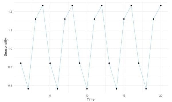
Notice that in both the data frame and the plot we have seasonality values on the full five year period. Furthermore, because we are only looking at seasonality, we seem to have “flattened” the series.
Accordingly, with this information, we can also “deseasonalize” the time series. To do this we simply need to divide the sales values (Y) by the seasonality values (S).
#Deseasonality
dfOut <- data.frame(dfOut, DES=(dfOut[, 2]/dfOut[, 5])) #Y/S dfOut %>%
  ggplot(aes(x=t, y=DES))+
  geom_line(col="light blue")+
  geom_point(col="black")+
  xlab('Time')+
  ylab('DES')+
  theme_minimal()
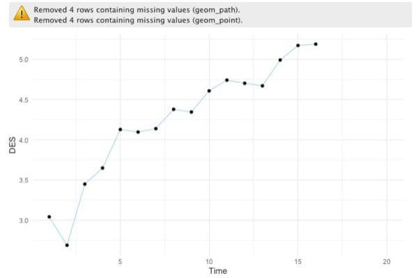
Once again, notice that we don’t have values for the fifth year, but remember the linear model we did before? Well, now that we have a way to account for seasonality on its own, we can actually use a linear model to predict the “deseasonalized” values for the fifth year and then multiply those values by the seasonal factor we calculated.
#Linear model
model <- lm(formula = DES ~ t, dfOut)

#Predictions
f <- predict(object = model, newdata = data.frame(t=dfOut[, 1 ]))

dfOut <- data.frame(dfOut, f=f)

#New prediction accounting for seasonality
predictions <- dfOut[, 7]*dfOut[,  ]

dfOut <- data.frame(dfOut, predictions = predictions)
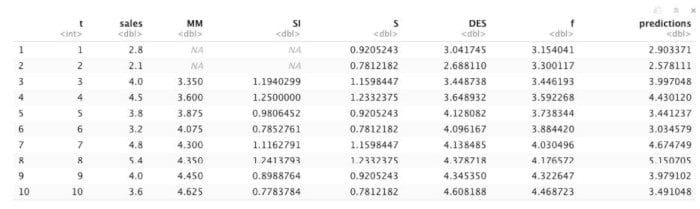
In the data frame, we can see that the predictions are really close to the actual sales values and this is because we are now accounting for all of the components of a proper time series analysis.
Putting everything together, we get the following function:
MultForecast<- function (k, df, Y){

  #Array with all of the raw values of 'Y'
  arr <- df[, Y]
  #Empty array to store the values of the moving averages
  MM <- rep(NA, length(arr))
  SI <- rep(NA, length(arr))
  index <- k-1

  #Calculate moving averages + SI
  for (i in c( 1:length(arr))){
    if (i <= length(arr) -k+1){
      block <- mean(arr[seq(i, i+(k-1))])
      MM[index] <- block
      SI[index] <- arr[index]/block #Seasonality + Irregular Component
      index <- index+1
    }
  }

  dfOut <- data.frame(df, MM=MM, SI=SI)

  #Seasonality
  varY<-c()
  for (j in c( 1:k)){
    varX <- seq(j, length(arr), by=k)
    varY <- c(varY, mean(dfOut[varX, 4], na.rm=T))
  }

  varY<- rep(varY, k+1)
  dfOut <- data.frame(dfOut, S=varY)

  #Deseasonality
  dfOut <- data.frame(dfOut, DES=(dfOut[ , 2]/dfOut[, 5]))

  #Linear model
  model <- lm(formula = DES ~ t, dfOut)

  #Predictions
  f <- predict(object = model, newdata = data.frame(t=dfOut[, 1]))
  dfOut <- data.frame(dfOut, f=f)

  #New prediction accounting for seasonality
  predictions <- dfOut[, 7]*dfOut[, 5]

  #Final data frame
  dfOut <- data.frame(dfOut, predictions = predictions)
  return (dfOut)
}
If we feed the value of “k”, a data frame, and the index of the “Y” column to the function, we get the final model with the new forecasted values. With that data, we can finally proceed to the gratifying task of plotting the model with the predicted values.
dfOut <- MultForecast(4, data, 2) dfOut %>%
  ggplot(aes(x=t, y=sales))+
  geom_line(col = 'light blue')+
  geom_point()+
  geom_line(aes(x=t, y=predictions), col = 'orange')+
  geom_point(aes(x=t, y=predictions), col = 'orange')+
  xlab('Time')+
  ylab('Sales')+
  theme_minimal()
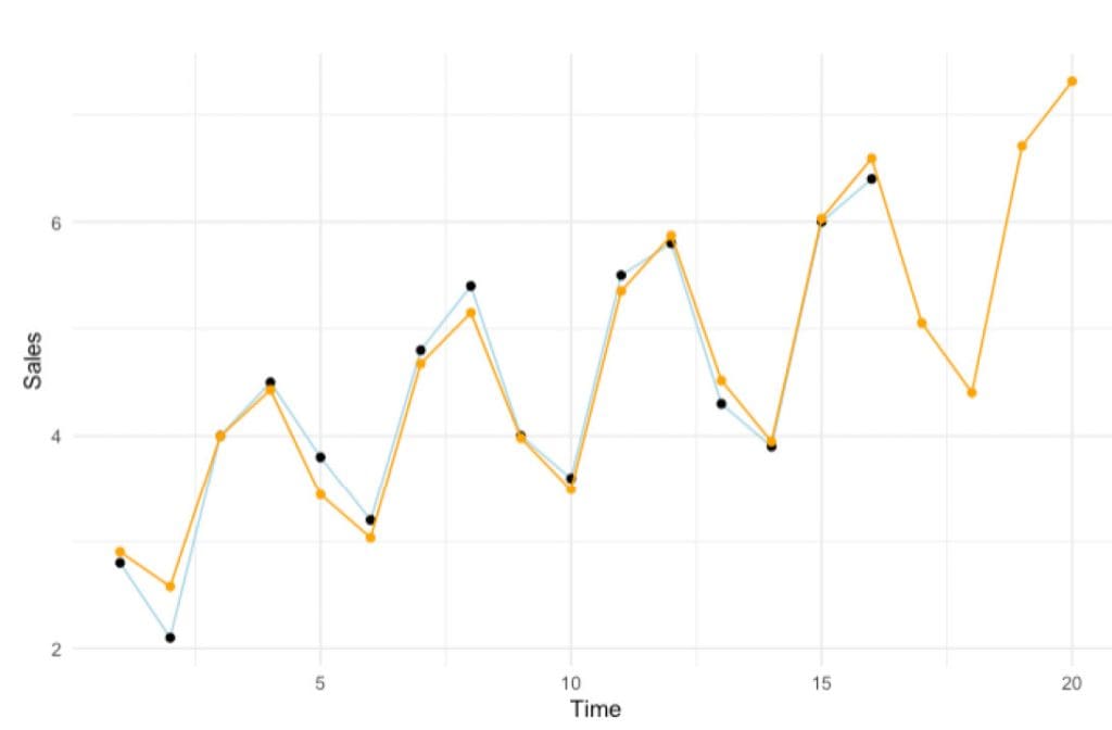
By comparing this model with the previous (initial) linear regression, we can see that we have certainly found a much better fit for the data.
One thing that you should consider is that in this case, we selected a “k” value of four to calculate the moving averages based on what made sense for the data, however, this task might turn out to be non-trivial and could require extensive exploration depending on what your dataset represents.
Moreover, the multiplicative time series approach might not work when there are random changes in the trend. For example, using data to forecast COVID-19 cases could give misleading results because the model only looks at historical data. Because there are active efforts to flatten the curve and change the trend, the task becomes more complex. Additionally, there can be random events and many other variables that could cause a change in the trend. Many of these changes won’t be picked up by the model ahead of time.
The good news is that there are many ways to extend and improve this analysis and a lot of great resources on this subject, such as the book “Forecasting Principles and Practice” by Rob J Hyndman. Hopefully though, by systematically going through each of the steps of a time series analysis you’ve gained the basic intuition behind this incredibly complex area of data analysis.
You can find the code from the article on GitHub.
Continue reading and listening


Stay in the loop.
Subscribe to our newsletter for a weekly update on the latest podcast, news, events, and jobs postings.